Does Tudor Have A “Design Tease” Issue?
This article examines a perceived pattern in Tudor's watch designs, suggesting that many models come close to perfection but are held back by a single, often puzzling, design choice. The author argues this phenomenon appears across various Tudor watches, from the Black Bay Pro to the Ranger, and explores potential reasons, including deliberate restraint to avoid overshadowing Rolex or simply a characteristic of Tudor's design ethos.
The author posits that Tudor watches often feel 90% finished, with a final design choice preventing them from being unambiguously excellent.
Examples of potentially problematic design choices include overly thick cases, strangely colored luminescent markers, or unusual dial colors.
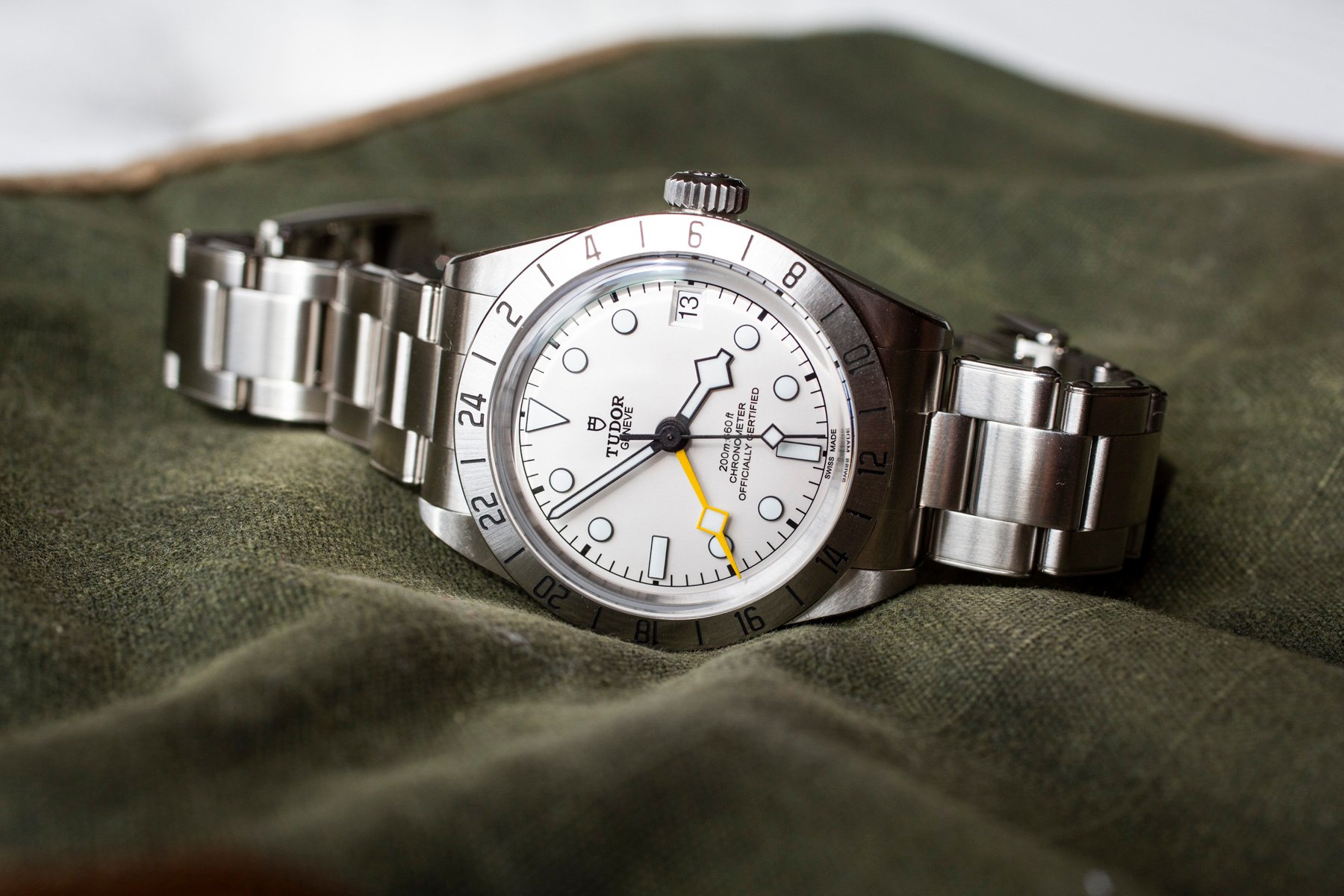
The Black Bay Pro is cited as an example, with its fixed 24-hour bezel, handset, and black dial closely resembling the vintage Rolex Explorer II ref. 1655, but the watch is criticized for being too thick and top-heavy for its 39mm case.
The new 39mm Black Bay Chrono is noted for its slimmer case and column-wheel chronograph movement, but its debut in a bright yellow dial is questioned as the sole initial offering, potentially hindering universal wearability.
The Ranger is mentioned as having a small lume tint issue that detracts from an otherwise good design.
One theory suggests Tudor deliberately undercuts its designs to avoid outshining its sister company, Rolex.
A more charitable explanation is that these are creative decisions reflecting Tudor's brand identity as a slightly rougher, more playful alternative to Rolex's austerity.